Usually the phrase "new and improved" does not make much sense because something either is new or did already exist and was improved upon. For the sidebar the situation is a little different. The core implementation is new but the content, the panels, did already exist. The concept, but not the name, of a sidebar has existed for many years both in Apache OpenOffice (and OpenOffice.org before that) and in IBM Lotus Symphony. In OpenOffice.org it was named "task pane" and was used primarily in Impress to give access to backgrounds, layouts, and shape and slide animations. Symphony renamed this to "property panel", extended it to all applications and covered even more frequently used tasks.
So, what did you improve?
The sidebar panels come from three different sources and have been improved in the migration process:
- The property panels that let you for example change the size of text or the color of shapes have all been migrated from Symphony. In the process we have cleaned up the code, made some improvements and fixed many bugs. While the property panels work really well, their implementation could profit from more cleanup. Removing duplicated code could reduce their code size and their complexity considerably. The one new property panel for inserting shapes into draw documents has roughly one tenth the number of code lines of the text property panel and still has about the same number of controls.
- The Impress panels come from OpenOffice. They allow you for example to control animations of slides and shapes. The new framework of the sidebar made big cleanups of their implementations possible. They are not view shells anymore; they are now regular controls. If you don't know what a view shell is, good for you.
- The third group consists of non-modal dialogs like the Navigator, the Gallery, or the Styles and Formatting dialog. Only small changes were necessary to plug them into the sidebar.
And what is new?
The core implementation of the sidebar and the framework provided for panel developers is completely new. The sidebar looks similar to the Symphony property panel but shares no code with it. One important new feature is that the sidebar is easily configurable via the, well, configuration. Another one is that extensions can now add new decks and panels that can freely mix with existing decks and panels. More on that later.
What exactly is "the sidebar"? 
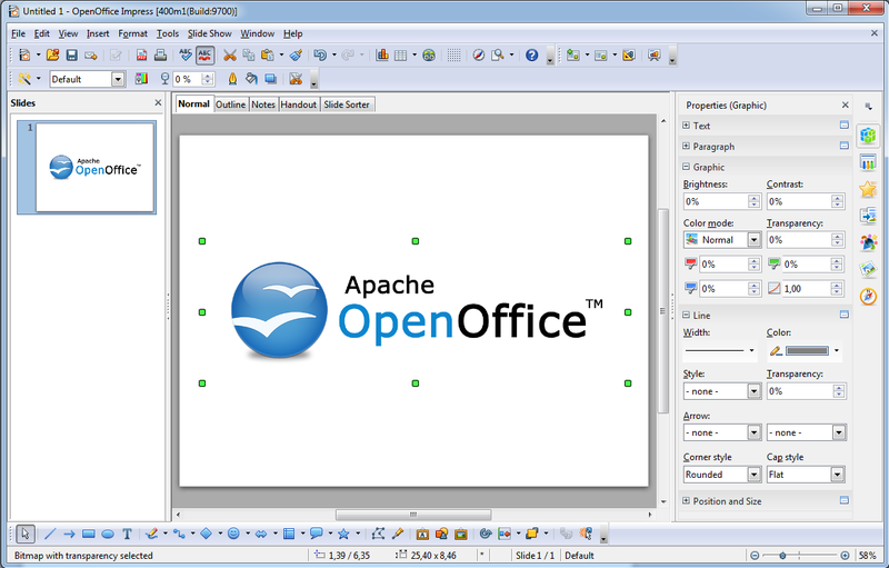
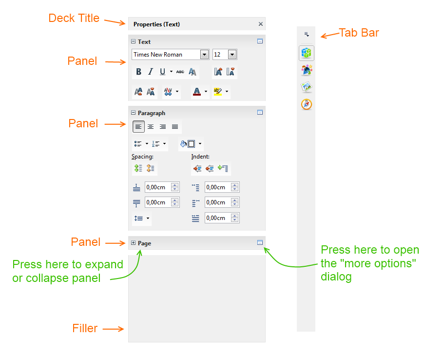
The sidebar is a window at the right side of the edit view of Writer, Calc, Impress and Draw. It provides access to frequently used tasks when editing documents. The content in the sidebar is organized into decks and panels. Decks are containers of panels, one or more of them. In very few cases there may not yet be a panel available for the current task. You can switch between decks by clicking on buttons in the tab bar at the right side of the sidebar. A menu allows you to hide decks that you don't need.
The deck that is open by default is the "Properties" deck. Its set of panels is context sensitive and varies depending on what you are currently doing. For example, if you are editing text in Writer then the "Text" panel allows you to change the font, text attributes, text and background color. The "Paragraph" panel has controls for changing bullet style, text alignment and various indents. The "Page" panel lets you change page size and orientation. It is collapsed by default. That means that you can only see its title bar. One click on it and you can see the panel. This avoids cluttering the user interface with panels that are only used occasionally while at the same time making them easily accessible for when they are used.
Why do you call it sidebar and not...?
The Symphony name "property
panel" did not work for us because the sidebar contains more than just
information about document properties.
The OpenOffice.org name
"task pane" came from the never realized idea of making OpenOffice.org
more task oriented. For example for the creation of form letters this
could have been an adapted version of the mail merge wizard that would
have displayed the general workflow and given access to templates,
address books and so on. This idea proved to be too difficult to
realize.
The name "sidebar" is generic enough to host very
different content such as document properties, clip art, navigator or
third party extensions. At the same time it is descriptive enough to be
remembered easily. Should you ever turn off the sidebar by accident
then you will have no problem finding the menu entry for the "bar" at
the "side" of the edit view and turn it back on.
Why add the sidebar now, why at all?
Up to now, we, the OpenOffice community (developers, UXers, testers), were busy getting the project going at our new home in the Apache community. After that came two releases and then graduation.
Only after that did we finally have the time to tackle the major task of combining the sidebars of OpenOffice and Symphony.
Many users have asked us in the past to add a Symphony-like sidebar to OpenOffice. The feedback in the Apache community regarding the sidebar in the coming release is very positive. Even downstream has started to integrate our implementation. Some of the benefits of the sidebar are:
- As in toolbars you have the most important functions for the current task available on a single click. Unlike the toolbars it does that in a single place while some toolbars are docked above the edit view, some are docked below, and still others are displayed floating in front of it.
- The position on the right side takes advantage of the form factor of most modern screens that have much more space in the horizontal direction than in the vertical.
- The sidebar provides more space to its panels than the tool bar areas provide to tool bars. Therefore panels can display more information better.
- The sidebar has a constant size (unless you decide to change that size). Context changes lead to different panels being displayed but do not change the size of the sidebar or the edit view. Dock a context sensitive tool bar and you will know how annoying such size changes can be.
What about extensions?
A little known feature of OpenOffice is that extensions can provide panels for the task panel (now called sidebar). These extensions are still supported. But now there is a better way to do this.
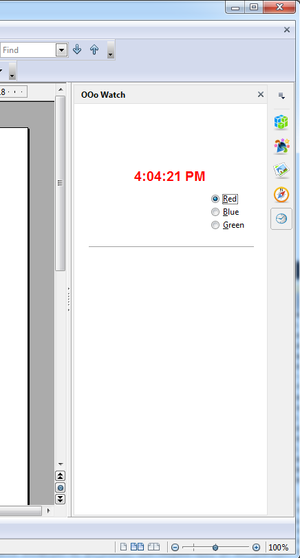
You can add a panel that is implemented in any language supported by the UNO API and display this panel in a deck of your choice or even in the properties panel. The panel can react to context changes such as different selections. But it does not have to. You want a panel that is only displayed when editing tables in Writer documents? No problem. You want to analyze a Calc document and display the result in real-time and always visible? That is possible. Or you can display the current time or weather.
Here is an example: an extension adds a deck (see the clock icon in the tab bar) and a panel that shows the current time.
We need your input
The toolbars and dialogs such as gallery and navigator are not yet scheduled to be disabled by default or even to be removed. Not because we don't think that the sidebar works. It does.The reason for keeping these established user interface elements is to let you become familiar with the sidebar in your own time. We hope that you will use the toolbars and dialogs less and less.
Apache OpenOffice is an open source project. You can help by telling us what you don't like and what you miss. Share your ideas about how to make the sidebar better. Write a comment in the comment section below or subscribe to our development mailing list if you are willing to invest a little more time. And Apache also accepts donations (not project specific).


