What am I looking at?
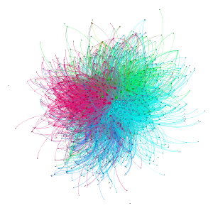
The above image illustrates the social network of posts and responses to the Apache OpenOffice project's main development mailing list, from when it started in May 2011 until the end of March 2013 when this data was collected. (Click on the image to view a larger version)
Each circle represents a person posting to the mailing list. The arcs represent responses to posts, i.e., they are drawn from the person posting to the person to whose post they are replying. The weight of each line is proportionate to the number of times person X responded to person Y. So darker lines portray more frequent communication pathways. The size of each circle is proportionate to the poster's eigenvector centrality, a theoretical measure of influence within the graph. The colors represent modularity classes, based a calculation that determines the most tightly-connected portions of the overall graph. These can represent real-world structures within the community.
Overall the graph has 1077 nodes (persons) and 8181 arcs (response emails). On average each person responded to 7.6 other persons, and made 27.1 total responses.
Now some interpretation. This is not the "hub and spokes" or tree pattern of a command/control or hierarchical organization, but a complex organism, with project participants contributing at various levels of engagement. The larger circles in the center, connected with many and darker lines, are the core project participants (at least on the development list). The very small circles at the periphery of the graph are those who posted a single question, received a response were never heard of again. They typically received one or two response posts, but did not really engage further. And in the middle we see additional rich structure of conversation patterns. The modularity classes, represented by colors here, appear to segment the list participants into what I'll call "programmers", "marketing" and "support", though these labels are imperfect.
It is difficult to ascribe too much meaning to these email response patterns. Some mailing lists have been the topic of research before. In Q&A forums, where nearly 100% of the initial posts are questions, and responses are all answers, it is interesting to look at the response patterns as an indication of expertise. See Adamic, et al., for a good example. We might apply a similar analysis to the support forums. But with the Dev list, an initial post might be a question, but it is often a report, or a proposal or just information sharing. And responses are not always expert answers or answers at all. Some responses are expressing approval or disapproval, or asking questions of their own. All these factors make this quite complex.
How I made the graph
- I started with the list archives, downloaded the mbox files extracted the response graph to a text file, with a custom python script, using the python "mailbox" package.
- Then I manually cleaned up the data, coalescing multiple mail accounts used by some members.
- I used the open source graph visualization package "Gephi" to process the data and draw the graph (layout via the Fruchterman-Reingold algorithm) and export it to a PNG file.